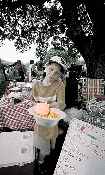
My entry into the Street Photography Salon for October. Didi Gilson’s Comment: “The desatch (my shorthand term for less saturated colors) of course gives the photo an apt old-timey effect which is effective. As does the boy’s offering his tempting wares. There’s the handwritten sign & the “SUMMER IS HERE” slogan and impression with the large, comforting tree and crowd in the background (park or back yard)… the webbed chair & cooler waiting for us to relax with some possibly handmade treat. I’m not sure if I find the orange color of the cold stuff outrageously endearing, appetizing or just sort’ve an enigma. This photo has a Norman Rockwell appeal.” My reply: “Oh yeah! David’s Ice Cream flavor of the week was Peach that week, and that was the real color; in fact, trying to get the ice cream right led to the muted colors in the whole scene, (that I kinda liked.)” Her reply: “Ah, that’s PEACHY, Sonny. Thanks for settling that for me. I can understand you going for that palette to suit um… the fruit!”
